Rebrand and rebuild for ZSL, London Zoo and Whipsnade Zoo.
A Robust and Reusable Design System for Three New Brands
Kicking off in early 2022, ZSL, and its Zoos, London Zoo and Whipsnade Zoo, approached TPX with a huge task. To take the discovery research we had conducted last year, and work alongside their brand agency to create a scalable, reusable, and accessible design system which could be used across three new Drupal sites.
The project was to run for ~1 year, kicking off in January (whilst the brand work was still ongoing), and ending with a launch of ZSL in October, and the Zoos together in early 2023.
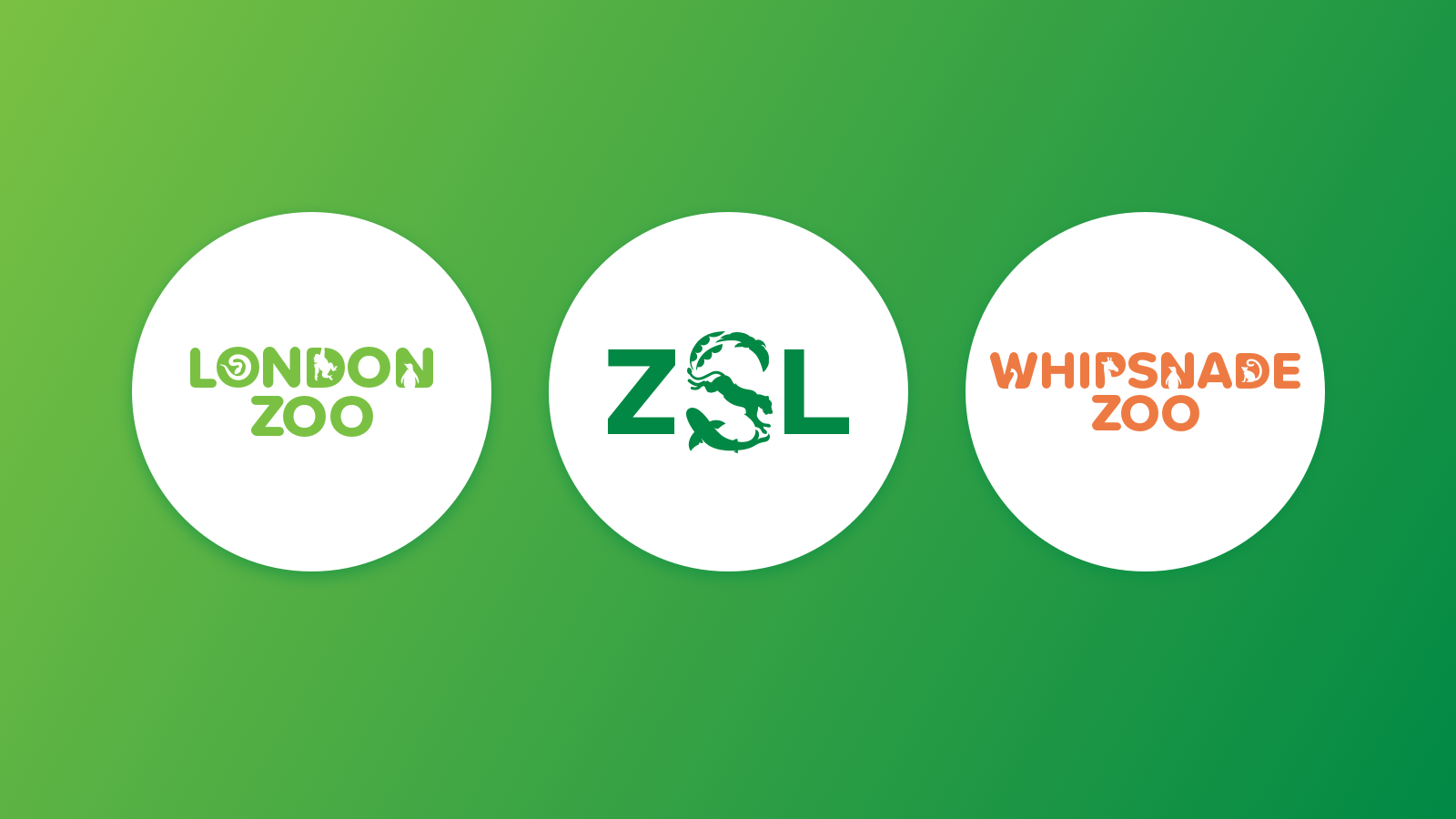
The new logo marks for each brand.
Branding, Tone, and Initial Visual Approach
With such a mammoth task to accomplish, we started with positioning and ambition. We were essentially at a point where we could influence the brand agency, and see some shape on the other side, as they were still in early(ish) stages.
I engaged with them early, looking through their concepts, and providing expertise from an accessibility and digital perspective; e.g. contrast levels, font styles and number on page load, etc. to develop the relationship. From the outset, we were then able to advise as the digital expert, and have judgement and influence over the digital application of the branding.
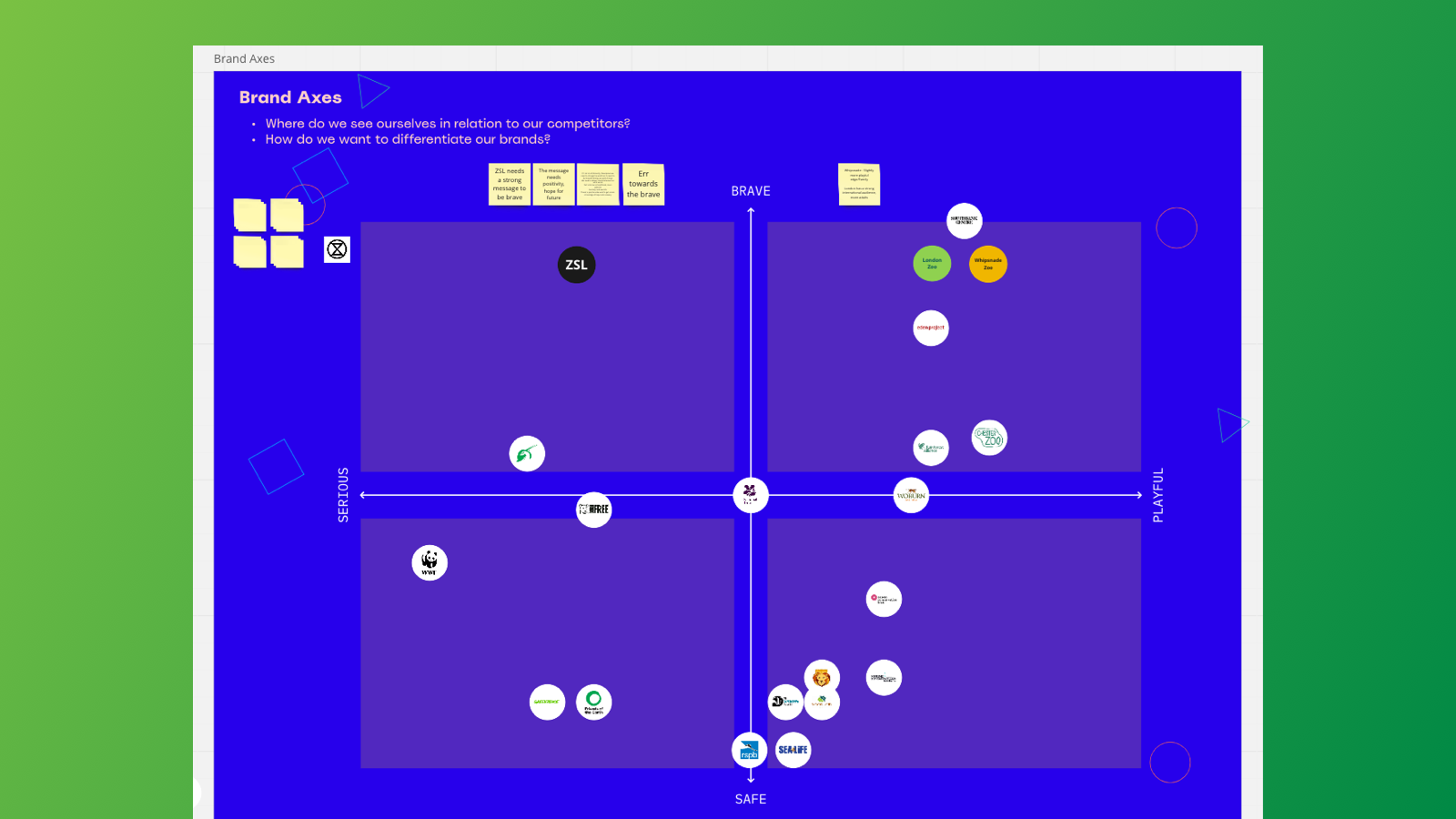
At the beginning of the project, I took the new branding, and made some 'taster' concepts for potential routes, which we used to gauge the water with ZSL, and see how adventurous they saw the new site being. We couple this with a brand positioning workshop, positioning them against their competitors on an axis, from 'Brave' to 'Safe' and from 'Serious' to 'Playful'.
This workshop helped us to get an idea of their ambition, but more importantly helped us to establish what the tonal and visual difference should be between the Zoo and the ZSL brands.
The brand axes in our workshop
Direction
From this workshop, we were able to establish our differentiating factors, and paint a clearer picture of how our design direction would begin to take shape.
The main differences were:
Zoos: Playful and engaging, imagery should focus on the animals, and have more of a subtle approach to brand motifs; e.g. the circle and curve.
ZSL: Simple and bold, with a clarity of message which conveys urgency, but also hope. More of an obvious nod to brand motifs, as the 'parent' brand.
Both: Evoke movement, interactions between the user and the page. Where used, it should be ‘in service, with purpose’. Show what is real. Show people where possible.
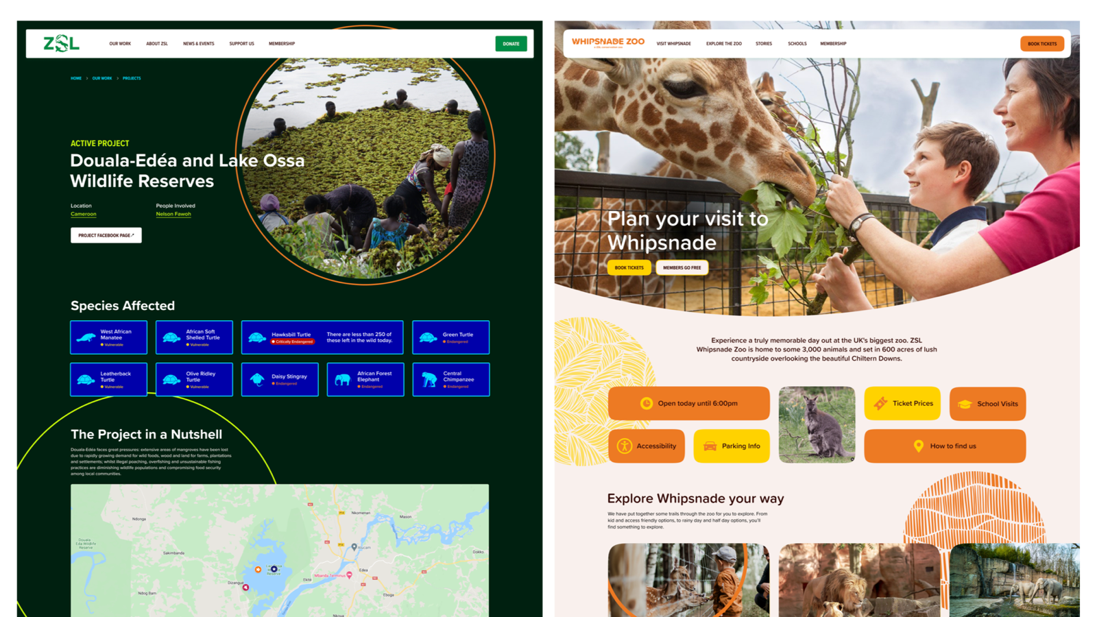
The initial design direction of ZSL (left) next to the Zoo (right).
Design and Build System
At the outset of the project, we decided that all 3 websites would use the same underlying set of components. The reason for this was twofold:
1. To allow the content teams at ZSL to think in the same way across 3 websites.
2. To streamline development, and keep a consistent pattern across all three brands.
To achieve this, we used styled components, storybook and figma to ensure that all spacing, sizing, padding etc. was consistent across all sites.
For more info on this project please feel free to contact me, otherwise, I would encourage you to checkout the sites, and visit the Zoos yourself!