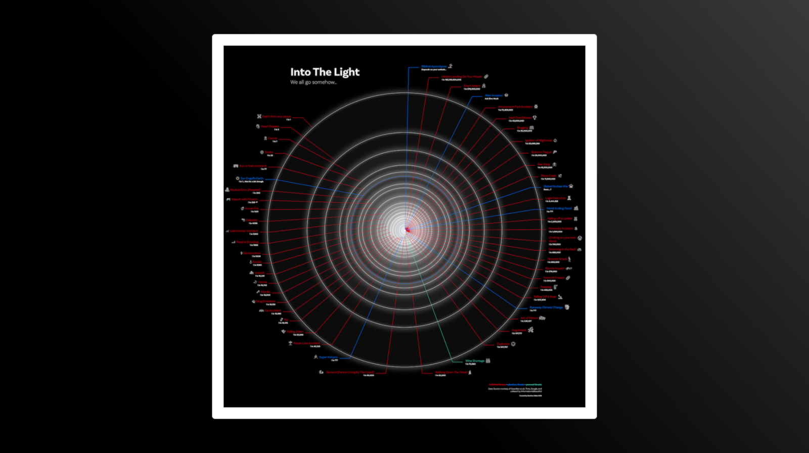
Project Abstract

The aim of this project was to visualise data, be it complex, or simple, in a visually pleasing way. The medium was undefined, as was the style, The piece could exist in an art gallery or on your iPhone, but it needed to tell a story.

Final Visualisation
Final Visualisation

Data Used

The data used was public record of the most likely ways to die, and was imagined in another form in the 'Data is Beautiful' book, who provide their data for free. You can view the piece in full resolution here.